
In the world of user interface (UI) design, visuals speak louder than words. One of the most powerful — yet often underestimated — elements is color. Beyond just making an app or website look appealing, colors influence how users feel, behave, and interact with a digital product. This phenomenon is known as color psychology, and understanding it is essential for creating effective and engaging user interfaces.
Let’s dive into how color psychology plays a crucial role in UI design and how designers can harness it to create better user experiences.
What is Color Psychology?
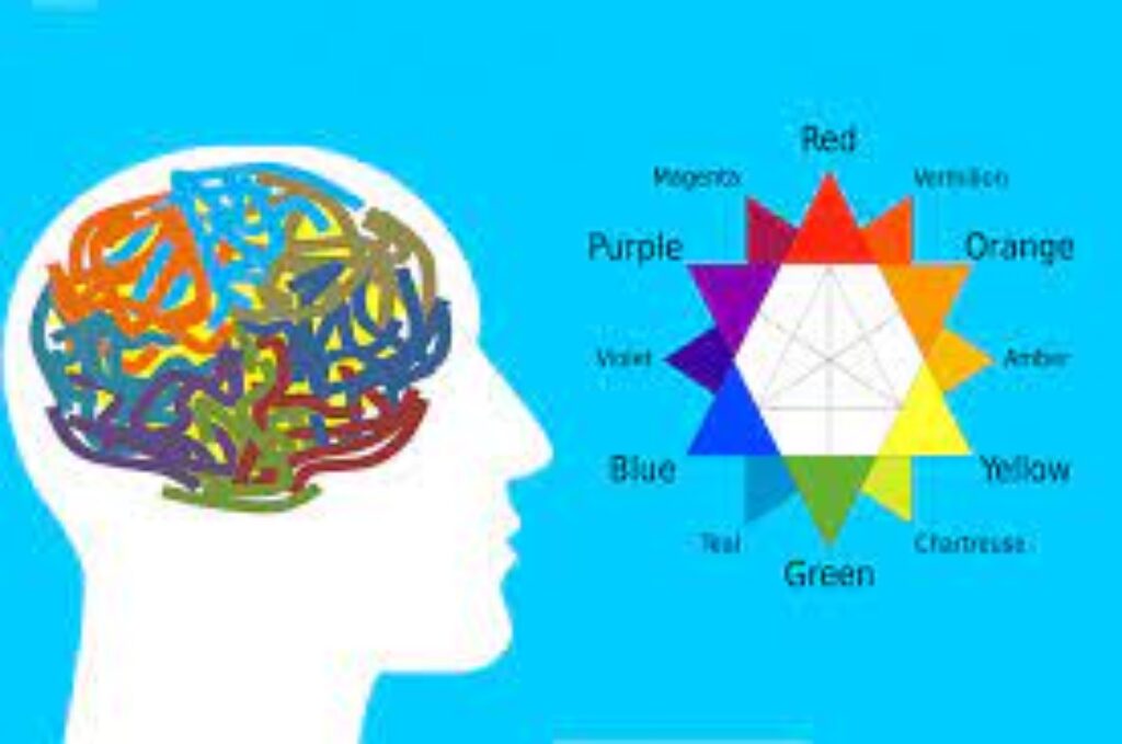
Color psychology is the study of how colors affect human behavior and emotions. Different colors can evoke specific feelings or associations. For instance, blue often represents trust and security, while red can evoke urgency or excitement.
In UI design, these associations help create an intuitive and emotionally aligned experience for users. The right color choices can guide user actions, enhance readability, and even boost conversion rates.
How Colors Influence User Behavior
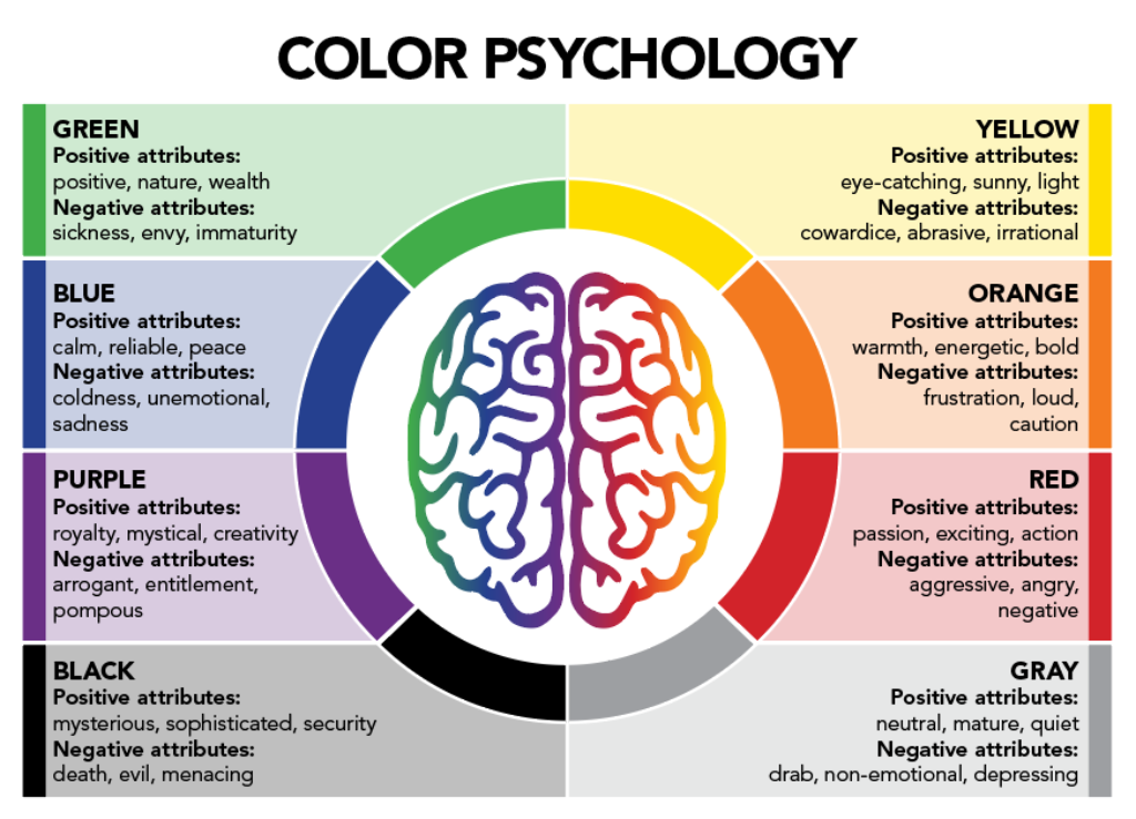
Here’s a quick breakdown of what common colors typically convey:
- Red: Urgency, excitement, passion. Often used for call-to-action buttons or sales banners to draw attention.
- Blue: Trust, security, calmness. Popular among financial institutions and social networks (think Facebook and PayPal).
- Green: Growth, health, stability. Commonly used in eco-friendly brands and finance apps.
- Yellow: Happiness, energy, caution. Used sparingly to grab attention without overwhelming the user.
- Orange: Enthusiasm, creativity, warmth. Frequently seen in marketing to encourage action.
- Purple: Luxury, wisdom, creativity. Often used for premium services or artistic platforms.
- Black: Sophistication, power, elegance. Common in luxury goods and fashion-related designs.
- White: Purity, simplicity, cleanliness. Often associated with minimalistic and modern interfaces.
Understanding these basic associations helps designers align color choices with the brand’s message and the user’s emotional journey.
The Role of Color in UI Elements
1. Brand Identity
Colors are a critical part of a brand’s identity. Consistency across an app or website strengthens brand recognition and trust. For instance, Google’s playful use of primary colors aligns with its brand image of being accessible and user-friendly.
2. Hierarchy and Focus
Color can guide users through an interface by highlighting important elements like primary buttons, navigation links, or alerts. A brightly colored button on a muted background draws the eye and prompts action without needing additional cues.
3. Readability and Accessibility
High-contrast color combinations improve readability and usability, especially for users with visual impairments. Designers must consider color contrast ratios and avoid relying solely on color to convey important information.
For instance, using red text to indicate an error without an accompanying icon or label could confuse users who are colorblind.
4. Emotional Connection
The emotional tone of your app or website is often set by its color scheme. A meditation app might use soothing blues and greens to promote calmness, while a fitness app might opt for energetic reds and oranges to inspire action.
Tips for Using Color Psychology Effectively
- Know Your Audience: Cultural differences impact color meanings. For example, while white symbolizes purity in Western cultures, it’s associated with mourning in some Eastern cultures.
- Use Accent Colors Strategically: Save bold colors for calls-to-action and important notifications to maximize impact.
- Maintain Visual Harmony: Choose a color palette with complementary tones to avoid overwhelming the user.
- Test and Adapt: Conduct A/B testing with different color schemes to see what resonates best with your users.
- Prioritize Accessibility: Use tools to check color contrast and ensure that your design is inclusive for all users.
Conclusion: The Power of Thoughtful Color Choices
Color is far more than just decoration in UI design — it’s a fundamental tool for guiding user behavior, conveying brand values, and evoking the right emotions. Thoughtful, strategic use of color psychology can transform a functional interface into a delightful user experience.
In today’s highly competitive digital landscape, paying close attention to how colors affect your users can be the key to standing out and creating interfaces that truly connect with people. Remember: when it comes to design, color isn’t just seen — it’s felt